
Signage Design ◦ Logo Refresh ◦ Brand Deliverables
Refreshing a boutique online rare book store through logo redesign and brand deliverables.
Red Fox Rare Books came to me with an old, pixelated logo that was in need of a refresh. They wanted to keep the original fox logo shape, but cleaned up and stylized with new colors and fonts.

We experimented with multiplying the fox logo and adding a color gradient.
While the owner rejected this style, it was important to me to show them the possibilities of what their logo could do if they chose to “mix it up” in the future.


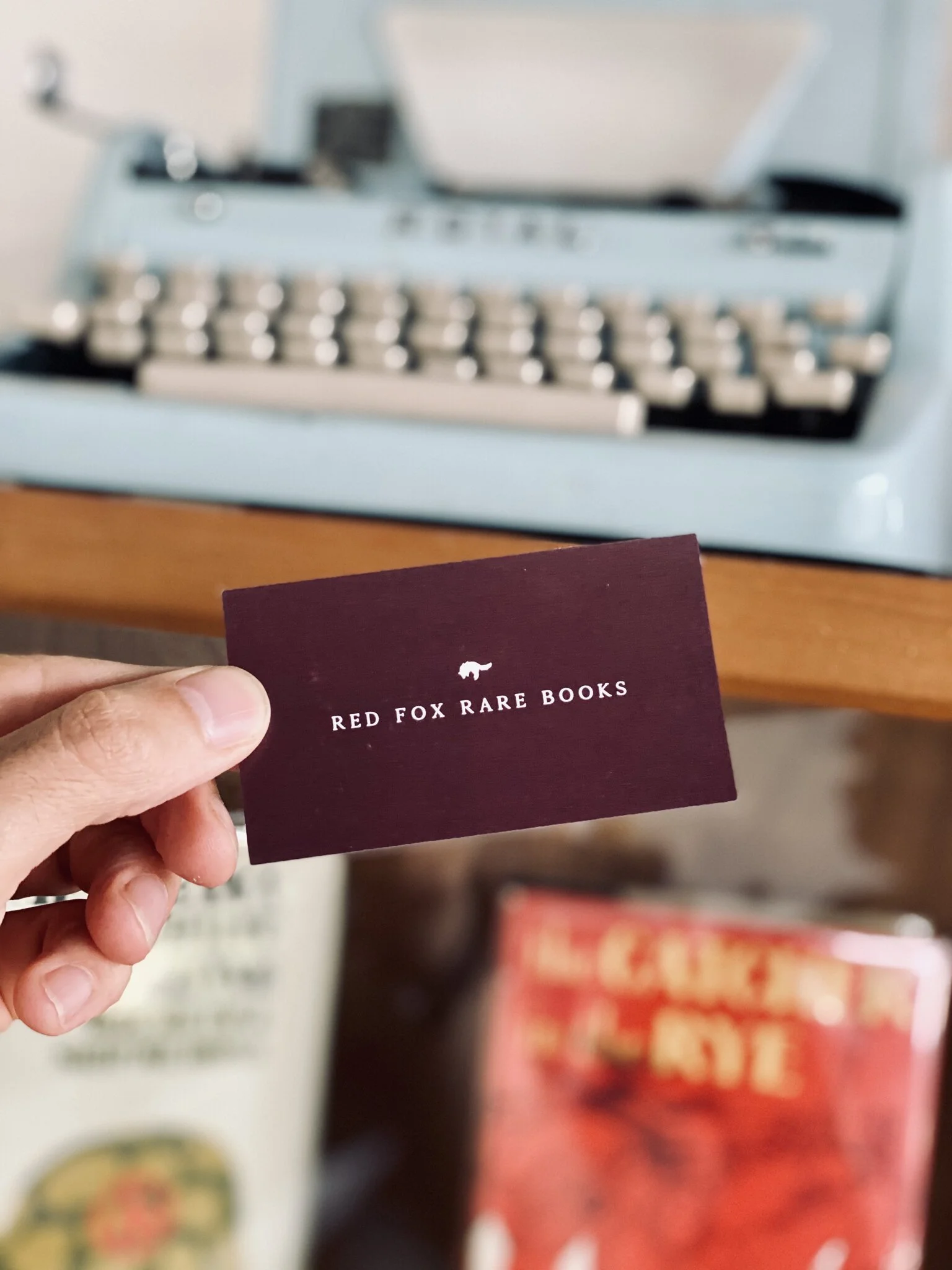
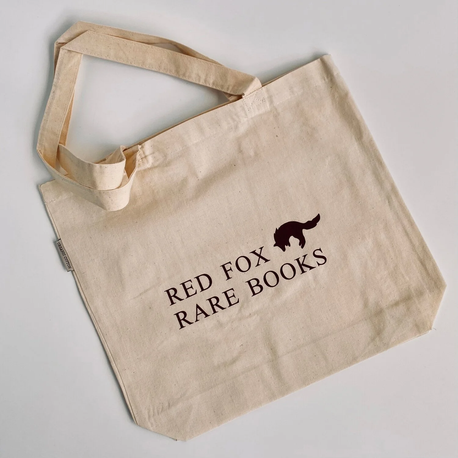
Finalized Refresh
The finalized brand refresh features an old school serif font pairing reminiscent of traditional book design, and a warm, cozy color palette.


Outcome & Final Thoughts
As a huge lover of books, it was a pleasure to work on a bookstore brand and learn about how things work in the rare book world. It was fun to be able to ask “what if?” and test some alternative options to a logo design. While the owner did not pick that option, it was still important to me that they trusted me to try it out.