Logo Design ◦ Illustration ◦ Brand Deliverables
Butter Creative Operations transforms your goals into smooth operations and lasting success.
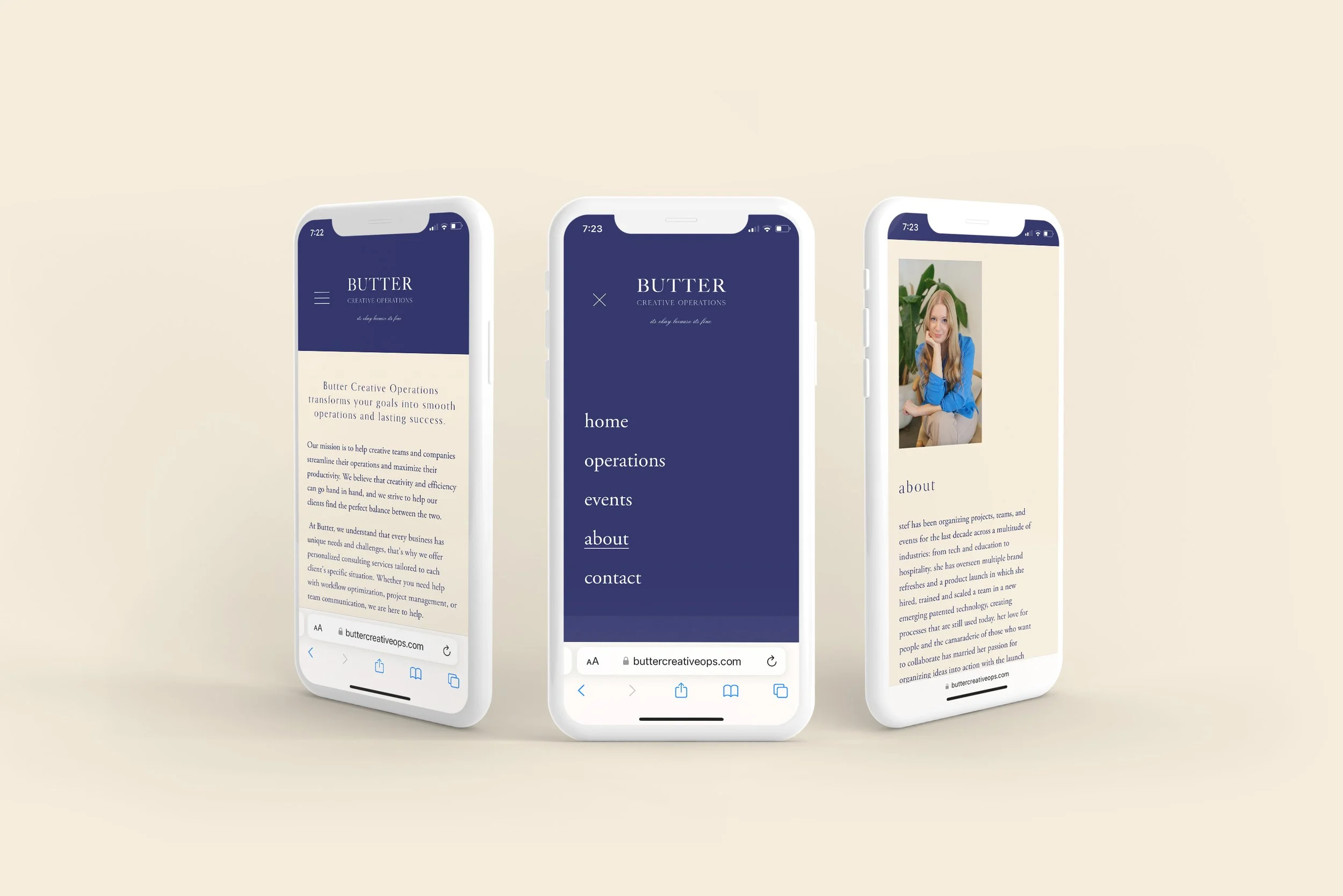
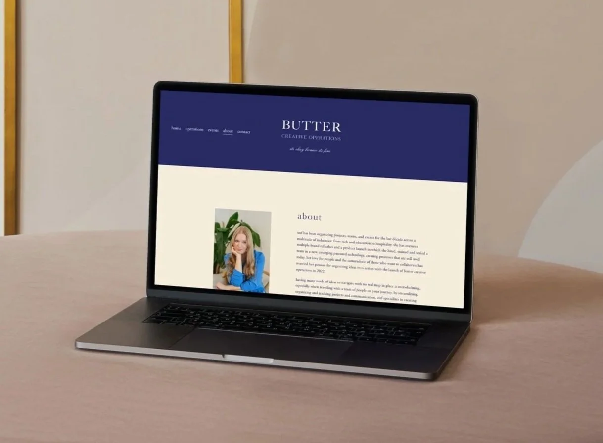
Butter Creative Operations is based in Portland, OR, with a mission to help creative teams and companies streamline their operations and maximize their productivity. Specializing in all things operations, from project management to workflow optimization to team communication, the Butter team was in need of a brand.
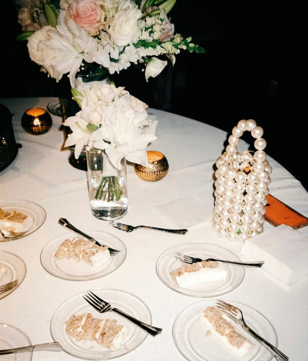
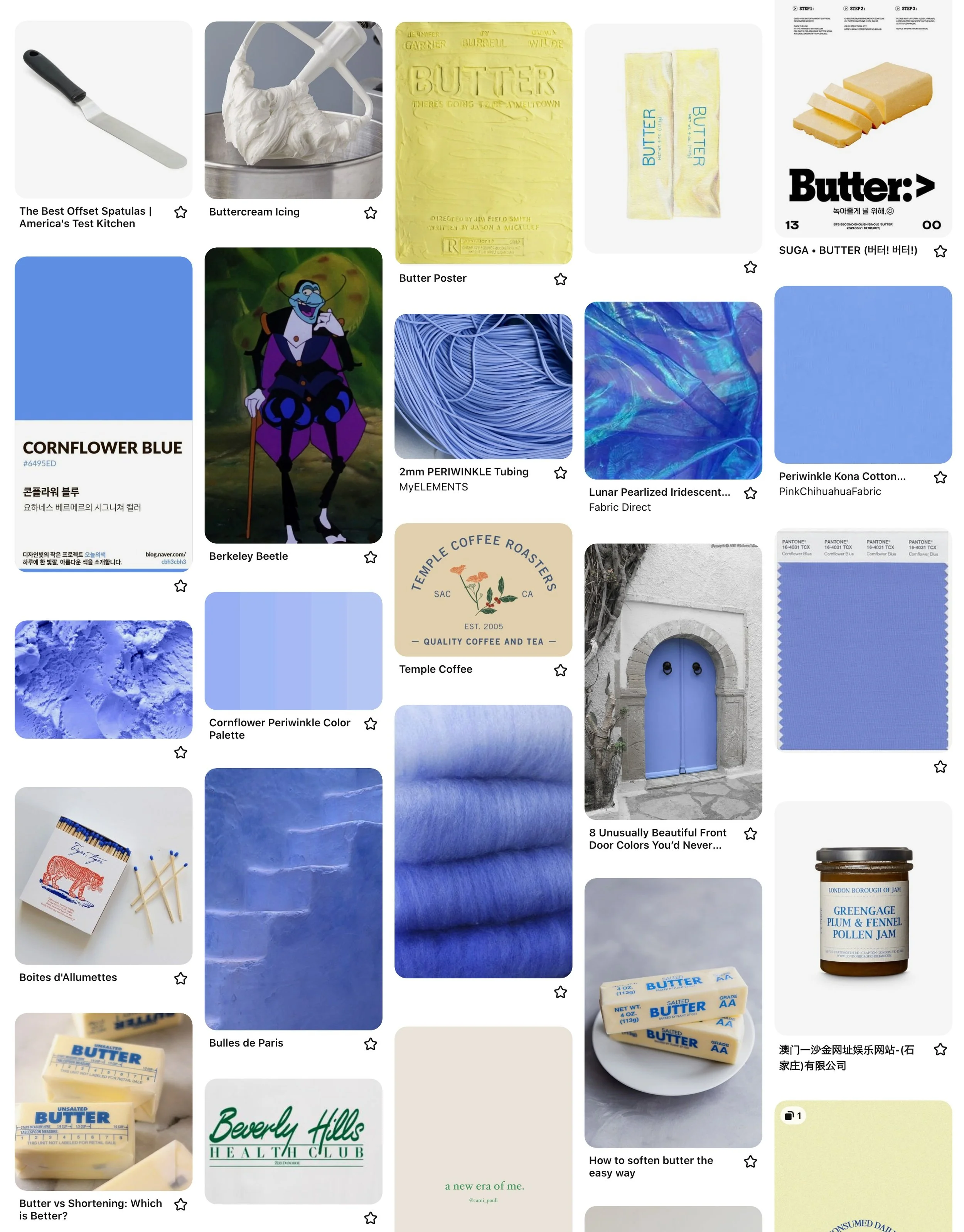
Moodboard
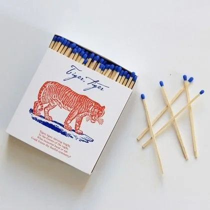
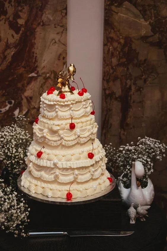
The moodboard we curated together featured vintage cake styling with heavy buttercream, hand-drawn elements, and a tagline from the owner’s Romanian grandmother: “it’s okay because it’s fine.”

Round 01
Pulling inspiration from vintage butter dishes and butter knives, the first round was explorative and focused on an illustrative approach.


Round 02
After a meeting following the first round, we decided to try a simpler illustration approach, and focus on only two colors.


Round 03
Feedback from the butter team was that they wanted to try a typographic only approach for the logo, and possibly incorporate icons or illustrations at a later date. We updated the moodboard and tightened up the overall concept, focusing only on typography and cornflower blue as the primary color.


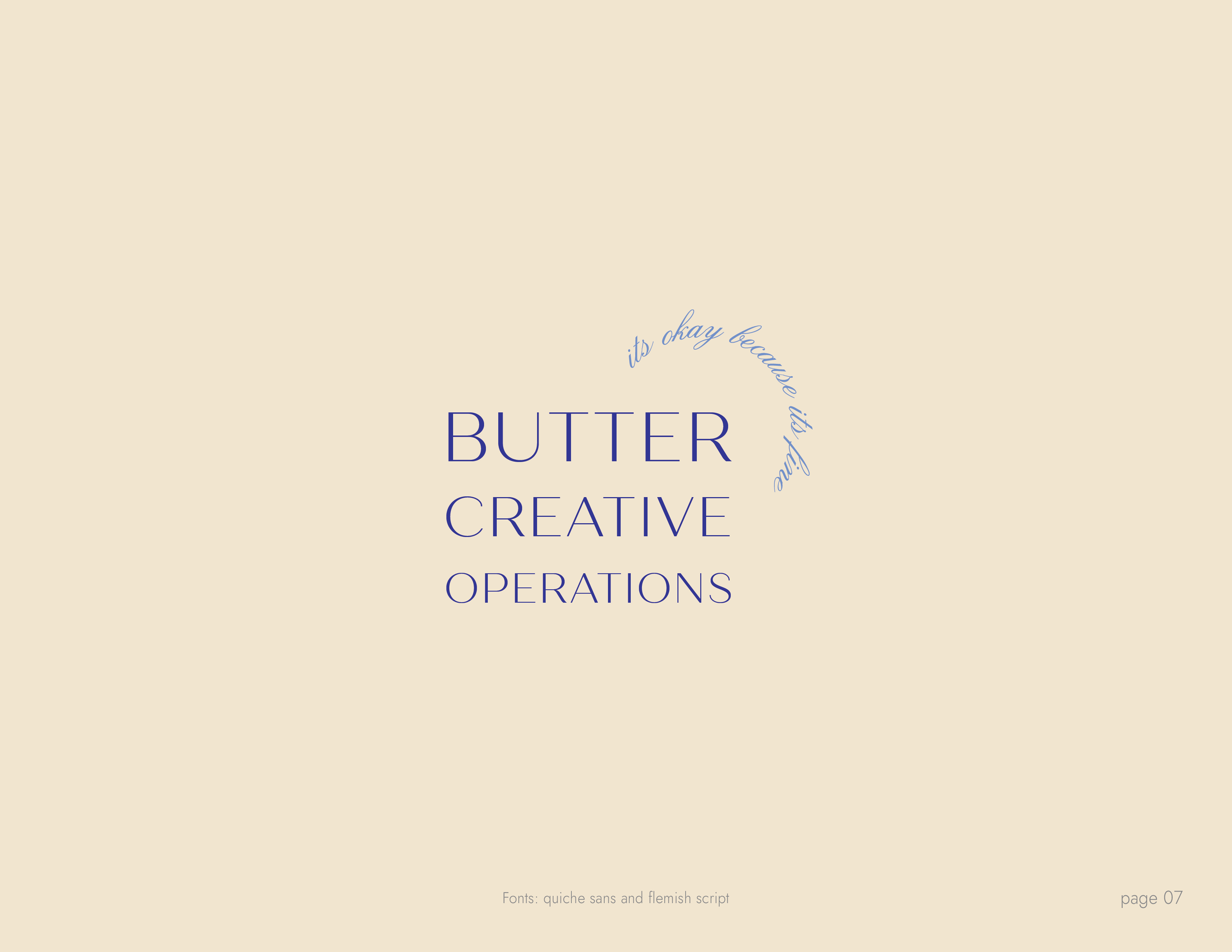
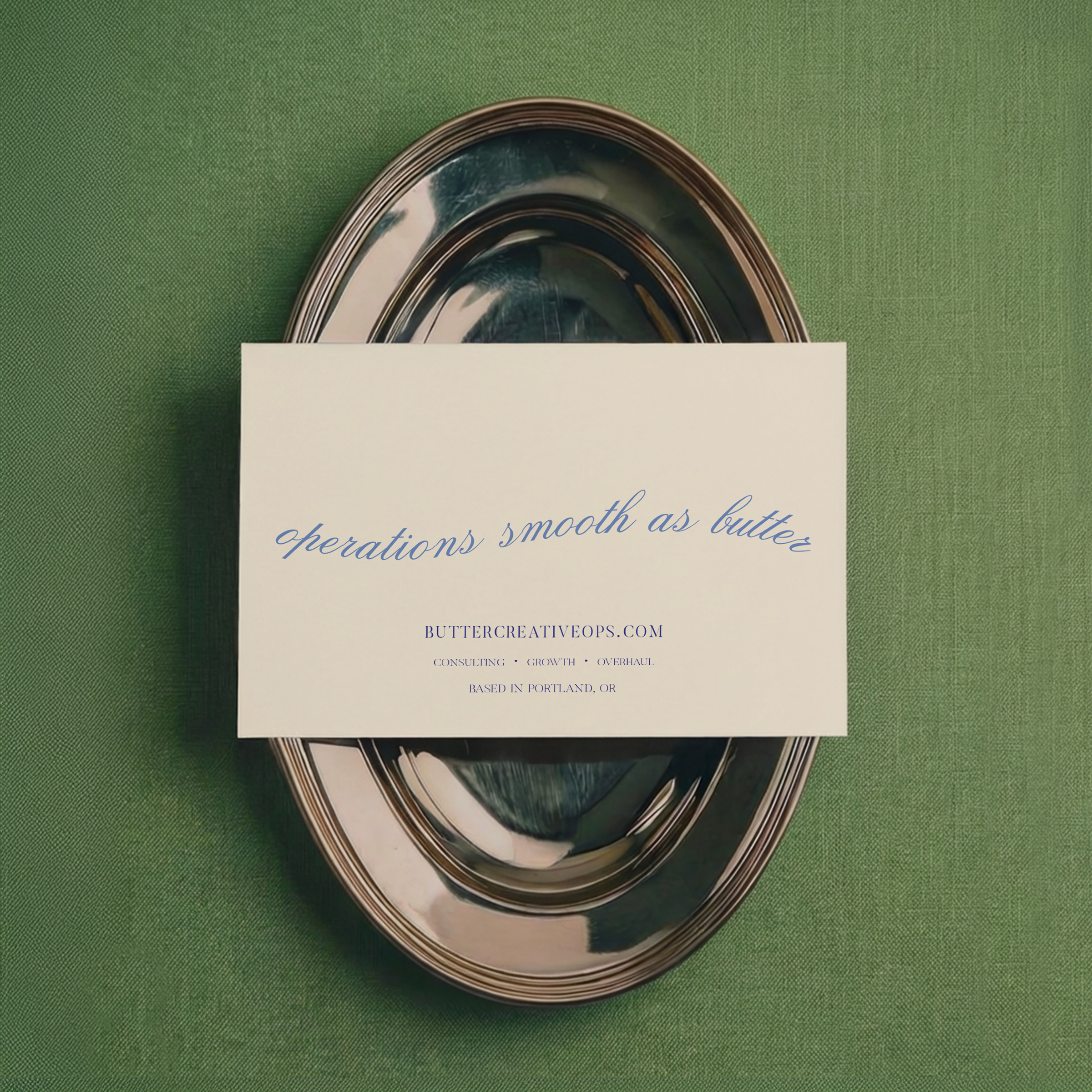
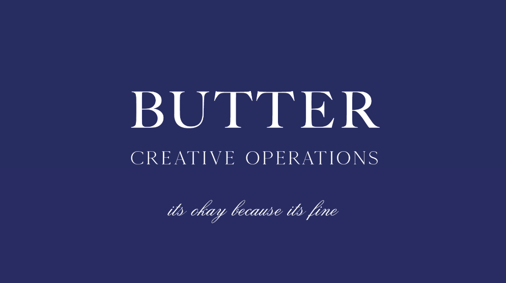
Finalized Logo
The owner decided that they wanted a logo that was a nod to butter packaging, but in a subdued and elevated approach.
We veered away from the periwinkle blue to a deeper tone, and the owner chose butler font for main typography and flemish font for the tagline.
Outcome & Final Thoughts
Working with Butter ensured that we were able to create a classic, elegant brand with some pun-related humor and a funny tagline. The owner was a dream to work with: they had a sense for what they wanted, they just needed my help in clarifying that image and bringing it to life.